CHANGES 1990 TO 2000
By 2000 it is clear that there is a lot of geographic
stability in how states fare in terms of INDEX in the
poorest county as a percentage of that in the most
affluent county. Certainly there is some jockeying
of position, but New England states are still heavily
represented in the top 10 (Figure 23). Perhaps most
interestingly, the bottom 10 in 2000 are all states
that were in the bottom grouping in either 1980 or 1990,
with one notable exception. New York state appears to
have the lowest level of INDEX in the poorest county
(New York County, $1825), expressed as a percentage of
that in the most affluent county (Putnam, $17,926), at
10.18 (Table 10). This is not primarily a result of
convergence in states such as Texas and New Mexico, but
rather a dramatic divergence in New York from 29.55
percent in 1990.
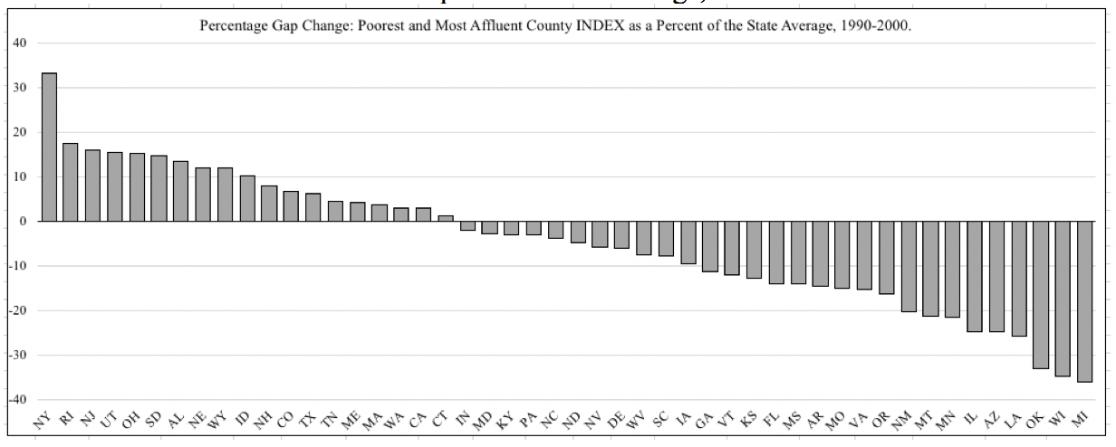
The percentage gap in 2000 remains higher in Texas,
New Mexico, Kentucky, and Colorado than in New York
(Table 10; Figure 24). However, Figure 25 reveals
that from 1990 to 2000 a majority of states closed
the percentage gap. Twenty nine states narrowed the
gap between the poorest and most affluent county,
often by a considerable amount. Michigan, Wisconsin,
and Oklahoma narrowed the gap by over 30 percentage
points, and Louisiana, Arizona, Illinois, Minnesota,
Montana, and New Mexico by over 20 reversing the general
trend in the 1980s. Of the states with an increasing
percentage gap New York stands out with over a 33
percentage point increase.
Figure 23. State Poorest County INDEX as a Percent
of the Most Affluent County INDEX by State, 2000,
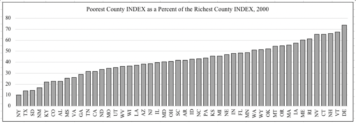 Figure 24. Poorest and Most Affluent County Percentage
Gap Compared to State Average, 2000
Figure 24. Poorest and Most Affluent County Percentage
Gap Compared to State Average, 2000
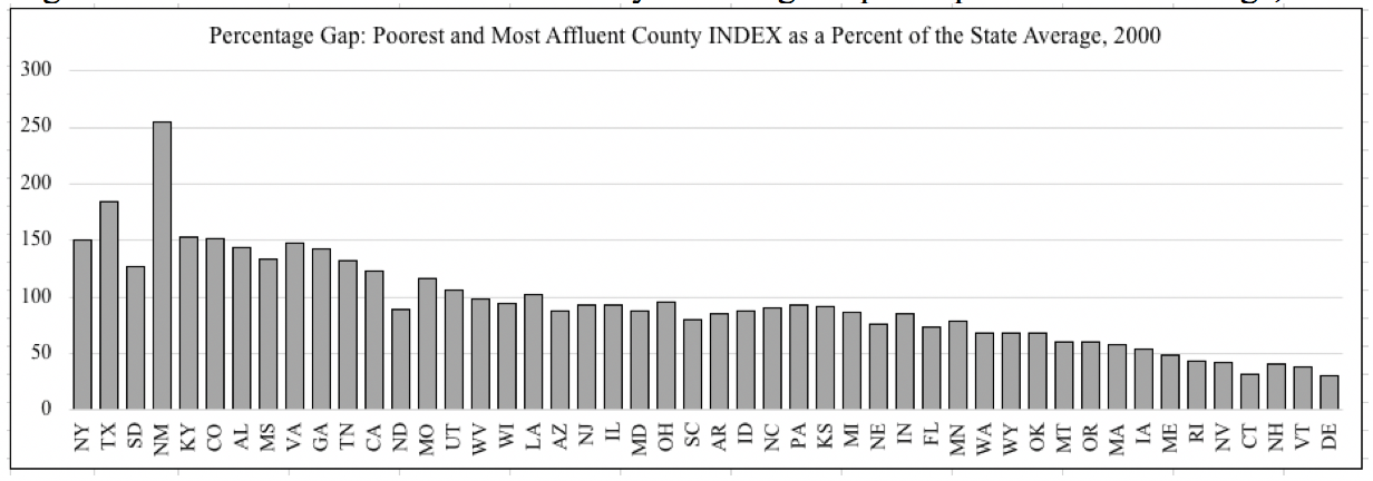 Figure 25. Change in Percentage Gap Between Poorest
and Most Affluent Counties Compared to State Average,
1990-2000
Figure 25. Change in Percentage Gap Between Poorest
and Most Affluent Counties Compared to State Average,
1990-2000