CHANGES 1980 TO 1990
By 1990 Texas remained the state where the poorest county
(Starr) had an INDEX that was lowest compared the most
affluent county (Collin), and Rhode Island remained at the
other end of the continuum (Figure 20). In Texas the
percentage dropped dramatically with the level of INDEX
in the poorest county, expressed as a percentage of that
in the most affluent county, of only 13.39%. In Rhode
Island the change was less dramatic with the percentage
dropping somewhat to 75.30. Of the 10 states with the
lowest INDEX compared to the most affluent county in 1980,
7 states remained in this group by 1990, namely Texas, New
Mexico, Kentucky, Mississippi, Virginia, Louisiana, and
Colorado. Tennessee, Georgia, and Alabama exited this bottom
10, to be replaced by South Dakota, Wisconsin, and Arizona.
The other end of the spectrum continued to be dominated by
states in New England
The percentage gap remained highest in New Mexico where it
increased significantly to 274.85 (Figure 21). As was the
case in Texas, in New Mexico the poorest county percentage
compared to the most affluent county dropped precipitously
from 23.75 to 13.9 (Table 10). Rhode Island also remained
the state with the lowest percentage gap at 26.58.
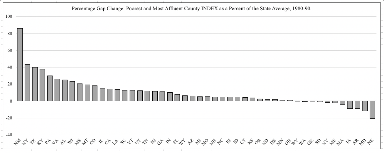
Looking at the change in percentage gap from 1980 to 1990
New Mexico represents the most extreme increase, followed
by New York, Texas, Kentucky, Pennsylvania, Virginia,
Alabama, Wisconsin, Mississippi, and Montana (Figure 22).
Only 11 states had a reduction in the percentage gap during
the 1980s which is an indication of some convergence between
the rich and poor counties. These states were Nebraska,
Maryland, Arkansas, Iowa, Massachusetts, Maine, Nevada,
South Dakota, Oklahoma, Washington, and West Virginia. The
magnitude of this reduction in the percentage gap is smaller
than the increasing percentage gap in other states, varying
between 20.61 in Nebraska and 0.06 in West Virginia. Thus
it seems that in general, the geographic expression of
inequality grew during the 1980s.
Figure 20. State Poorest County INDEX as a Percent of
the Most Affluent County INDEX by State, 1990,
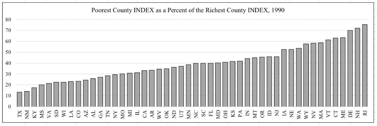 Figure 21. Poorest and Most Affluent County Percentage
Gap Compared to State Average, 1990
Figure 21. Poorest and Most Affluent County Percentage
Gap Compared to State Average, 1990
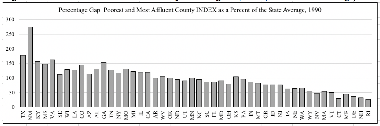 Figure 22. Change in Percentage Gap Between Poorest and Most Affluent
Counties Compared to State Average, 1980-90
Figure 22. Change in Percentage Gap Between Poorest and Most Affluent
Counties Compared to State Average, 1980-90