CHANGES 2000 TO 2010
By 2010, the picture of inequality within states had
not changed much. The listing of the bottom 10 remained
the same in 2010 as in 2000, except that Tennessee entered
the list and Mississippi left it. Within this bottom ten,
5 states appeared in all four study years; Colorado,
Kentucky, New Mexico, Texas, and Virginia. Another four
appeared on the list in three of four years (Alabama,
Georgia, Mississippi, South Dakota), three appeared in
two of the years (Louisiana, New York, Tennessee), and
just two states placed in the bottom list for a single
year (Arizona, Wisconsin) (Table 10). In 2010 Texas once
more became the state where the poorest county where INDEX
was the lowest percent of the most affluent county, but New
York fared little better. The percentage in Texas was 10.68
compared to 12.85 in New York. At the other end of the spectrum
were Delaware and Connecticut with percentages of 81.37 and
69.25 respectively (Figure 26).
The largest percentage gap in 2010 was in New Mexico (248.97)
closely followed by Texas (245.31) (Table 10; Figure 27). The
narrowest percentage gap was in Delaware (21.08) followed by
Connecticut (36.90) and Vermont (37.89). The narrowest gaps
continue to be in the New England region.
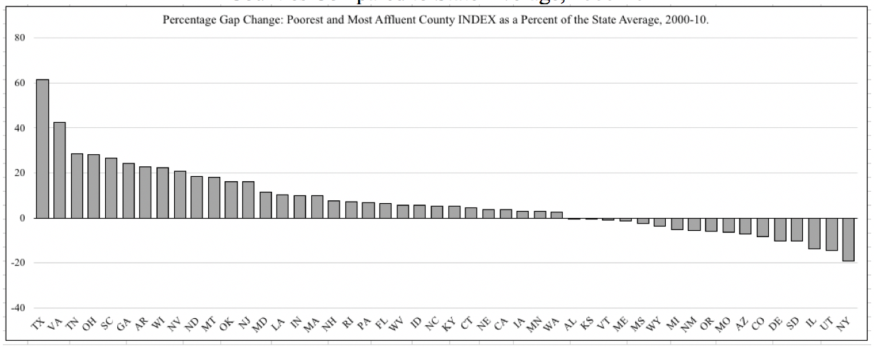
Looking at the change in percentage gap from 2000 to 2010,
the gap widened in 31 states and narrowed in 17. The biggest
narrowing of the percentage gap was in New York where the gap
shrank by a little over 19 points. In 9 states the percentage
gap expanded by more than 19 points, with a maximum in Texas
of a 61.43 percentage point increase (Figure 28). It seems
that the general narrowing of the gap observed in the 1990s
did not continue in the first decade of the 21st century, but
instead is similar to the widening gaps seen in the 1980s.
Figure 26. State Poorest County INDEX as a Percent
of the Most Affluent County INDEX by State, 2010,
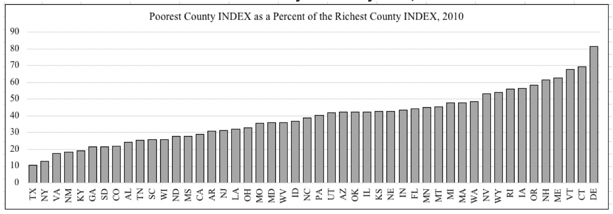 Figure 27. Poorest and Most Affluent County Percentage
Gap Compared to State Average, 2010
Figure 27. Poorest and Most Affluent County Percentage
Gap Compared to State Average, 2010
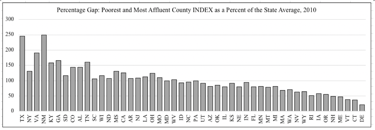 Figure 28. Change in Percentage Gap Between Poorest and
Most Affluent Counties Compared to State Average, 2000-10
Figure 28. Change in Percentage Gap Between Poorest and
Most Affluent Counties Compared to State Average, 2000-10