CHANGES 1980 TO 2010
As discussed previously, a majority of states experienced a
widening percentage gap between 1980, and 1990 as well as
from 2000-2010, while from 1990 to 2000 the gap narrowed.
Figure 29 illustrates the combined impact of these changes
over the 30-year study period by looking at the change in
the gap from 1980 to 2010. Over this thirty year period the
percentage gap increased in 33 states and narrowed in 15.
Texas showed the largest increase in percentage gap at 107.48,
while Michigan's gap shrank the most by 36.23 points. It
seems that there has been little progress in geographic
inequality over the last thirty years, and in most states such
inequality has increased. As can be seem visually in Figure
30, the states where spatial inequality has shrunk to some
extent are Michigan, Arizona, Illinois, Oregon, Oklahoma,
Minnesota, Missouri, Iowa, Delaware, Kansas, Nebraska,
Maryland, West Virginia, Louisiana, and Arkansas. While this
listing may seem extensive 6 of these states saw a minimal
single digit contraction in the gap, leaving only 9 states
with a double-digit change. In contrast 24 of the 33 states
that displayed a widening gap experienced at least a double
digit change.
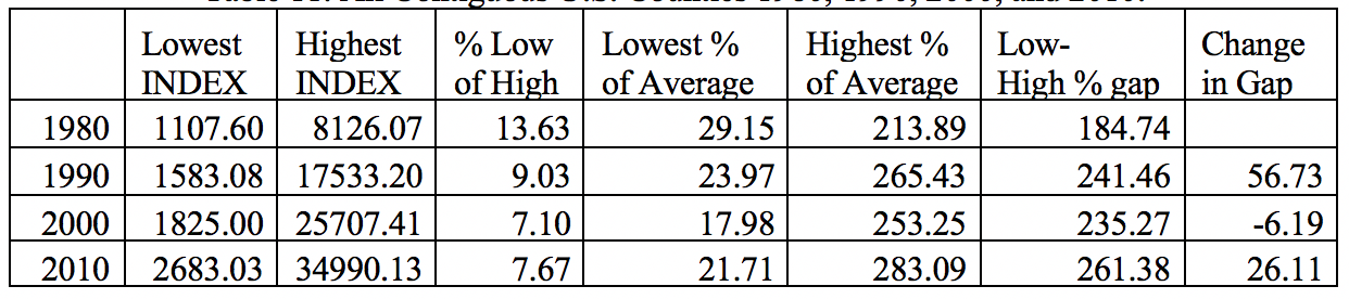
Finally, if the data for all counties in the contiguous United
States is explored (Table 11), it is clear that spatial
inequality in general has been sustained or even strengthened
over the 30-year study period. INDEX in the poorest county,
expressed as a percentage of that in the most affluent county,
dropped significantly from 1980 (13.63) to 1990 (9.03), and
dropped again in 2000 (7.10). There was a slight rise in 2010,
and the same pattern is evident when looking at the INDEX in the
poorest county as a percentage of average. In contrast the
percentage of the average in the most affluent county went up
consistently in all four study years. In 1980 compared to 2010
the situation in the poorest county compared to the average got
worse dropping from 13.63 to 7.67, whereas in the most affluent
county the percentage increased from 213.89 to 283.09 and the
percentage gap increased from 184.74 to 261.38. Spatially it
seems that the rich got richer and the poor poorer.
Figure 29. Change in Percentage Gap Between Poorest
and Most Affluent Counties Compared to State Average,
1980-2010
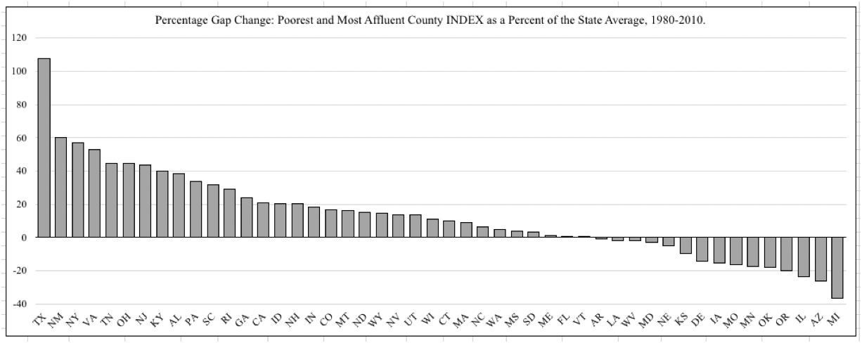 Figure 30. Change in Percentage Gap Between Poorest and
Most Affluent Counties Compared to State Average, Mapped
by State 1980-2010
Figure 30. Change in Percentage Gap Between Poorest and
Most Affluent Counties Compared to State Average, Mapped
by State 1980-2010
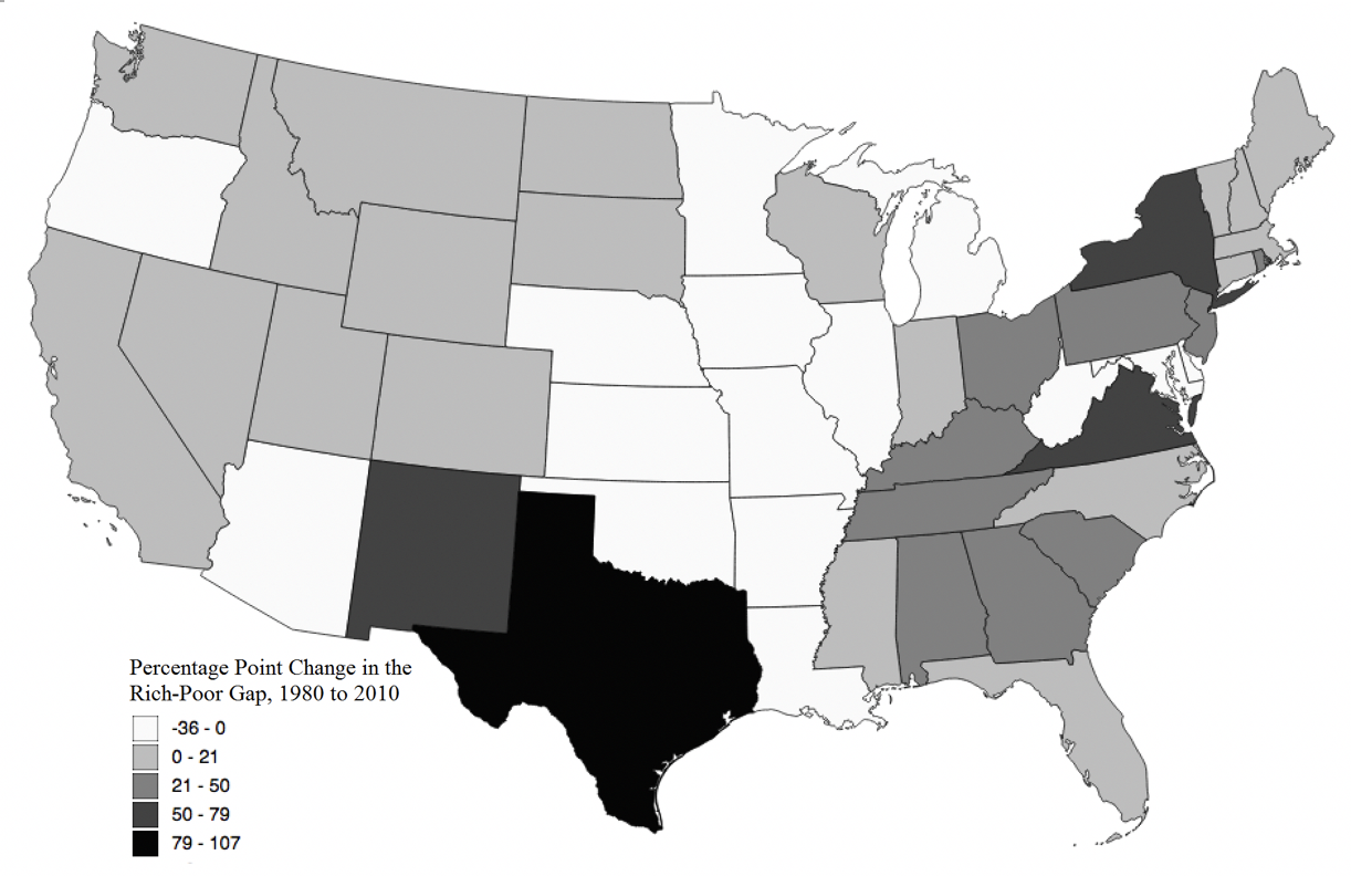 Table 11. All Contiguous U.S. Counties 1980, 1990,
2000, and 2010.
Table 11. All Contiguous U.S. Counties 1980, 1990,
2000, and 2010.
 SOME CHARACTERISTICS OF URBAN POVERTY VERSUS AFFLUENCE
As has been discussed previously, poverty tends to be associated
with rural countries, while affluence is to be observed
primarily in metropolitan areas. However, the poorest and the
richest counties were both urban in 2000 and 2010. So the
question should be asked how do these poor versus affluent
urban counties differ from each other in fundamental terms?
Leaving the unique Los Alamos and Loving counties aside, it seems
that the Bronx, New York and Fairfax County, Virginia represent
the extremes of U.S. poverty and affluence located in the
'Boswash' megalopolis.
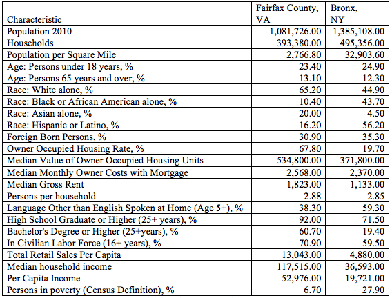
Table 12 details some characteristics of the Bronx and Fairfax
County, in order to explore some basic differences between the
counties that represent the richest and the poorest. In some ways
these two counties are very similar. Both are quintessentially
urban, are home to a similar number of residents, have a similar
age structure, a similar household size, and the percentage of
foreign born residents in both counties is somewhat comparable.
However, several differences stand out.
First is the contrast in population densities with the Bronx
being 11.89 times more densely populated than Fairfax County.
The racial profile of the two areas is quite different with the
Bronx being home to a high percentage of African-American and
Hispanic residents in contrast to Fairfax County where white and
Asian residents dominate demographically. The difference in
educational achievement, especially beyond high school is, clear
with Fairfax County having a majority of residents, and more than
three times the rate in terms of holding a bachelor's degree or
higher than in the Bronx. Income and employment levels are also
much higher in Fairfax County than in the Bronx. For example,
median household income in Fairfax County is 3.2 times that
in the Bronx.
Table 12. Characteristics of the Counties Considered the
Richest and Poorest in 2010.
SOME CHARACTERISTICS OF URBAN POVERTY VERSUS AFFLUENCE
As has been discussed previously, poverty tends to be associated
with rural countries, while affluence is to be observed
primarily in metropolitan areas. However, the poorest and the
richest counties were both urban in 2000 and 2010. So the
question should be asked how do these poor versus affluent
urban counties differ from each other in fundamental terms?
Leaving the unique Los Alamos and Loving counties aside, it seems
that the Bronx, New York and Fairfax County, Virginia represent
the extremes of U.S. poverty and affluence located in the
'Boswash' megalopolis.
Table 12 details some characteristics of the Bronx and Fairfax
County, in order to explore some basic differences between the
counties that represent the richest and the poorest. In some ways
these two counties are very similar. Both are quintessentially
urban, are home to a similar number of residents, have a similar
age structure, a similar household size, and the percentage of
foreign born residents in both counties is somewhat comparable.
However, several differences stand out.
First is the contrast in population densities with the Bronx
being 11.89 times more densely populated than Fairfax County.
The racial profile of the two areas is quite different with the
Bronx being home to a high percentage of African-American and
Hispanic residents in contrast to Fairfax County where white and
Asian residents dominate demographically. The difference in
educational achievement, especially beyond high school is, clear
with Fairfax County having a majority of residents, and more than
three times the rate in terms of holding a bachelor's degree or
higher than in the Bronx. Income and employment levels are also
much higher in Fairfax County than in the Bronx. For example,
median household income in Fairfax County is 3.2 times that
in the Bronx.
Table 12. Characteristics of the Counties Considered the
Richest and Poorest in 2010.